
May. 24, 2017 10:32 am / Posted by Michael Eric to Office Tricks
Follow @MichaelEric
Making graphs and charts is the common and basic requirement for working people. Nowadays, most of the office workers use Microsoft Excel to make charts. Since the latest Excel version is Excel 2016, in this tutorial, we shall show you how to make a graph in Excel 2016/2013/2010/2007/2003 in the year of 2017.

When you open an Excel document, there are 3 kinds of graph types mainly, which are:
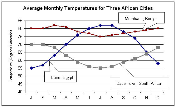
Line Graphs: Line Graphs do well in displaying tendency over time, such as average number of hours worked in a week and product trends by month. Either 2-dimension or 3-dimension line graph is effective in Microsoft Excel.
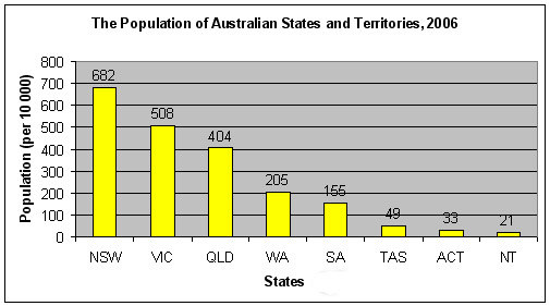
Column Graphs: Column Graphs also help the observers to see how the parameters vary as time goes on. However, they are able to be named “graphs” only if a single data parameter is used. Once the diversified parameters are joined in, readers couldn’t gain any discernments about how each single parameter has turned.
Bar Graphs: Bar Graphs are quite analogous to column graphs, but its constant parameter is allocated to the Y axis and variables are in the X axis.

To create a graph in Microsoft Excel document, you will need to do the following steps.
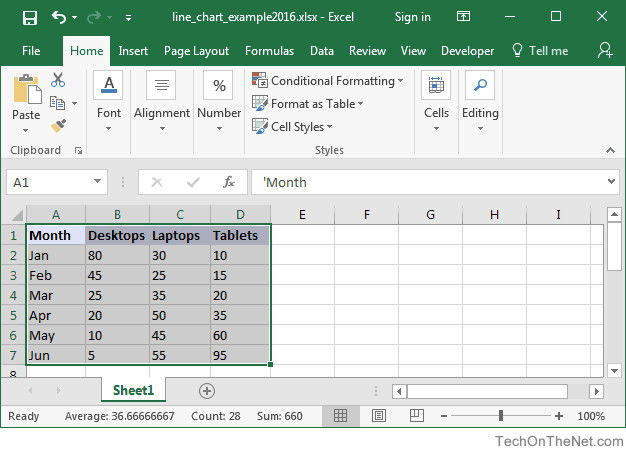
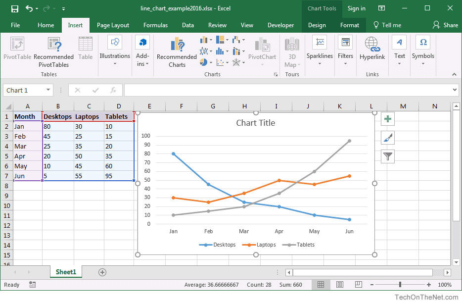
Step 1. First of all, you have to launch Excel and input your data with table into Excel spreadsheet. This is quite simple for you. After that, highlight the data in the table cell that you wish to use for the graph.
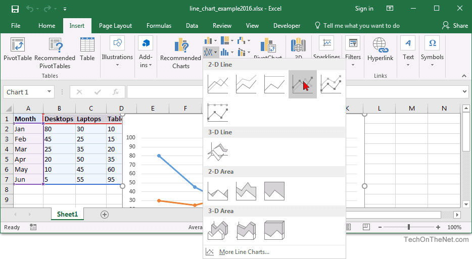
Step 2. Choose the “Insert” option in the header of Excel tool bar. Click on the Line Chart button in the Charts group. After that, choose your target chart from drop down menu.
Step 3. Now you can see the graph shown next to your table. Its content is synched with your table data and each of them are appeared with X axis and Y axis
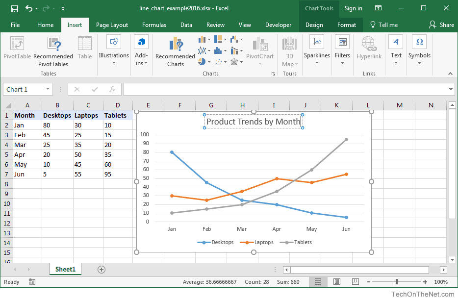
Step 4. At last, you had better give a chart title of your graph. Click on the “Chart Title” and enter the text for the line graph.
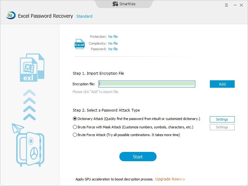
By the way, if you created a password in Excel spreadsheet, however, you can’t remember the password for various unknown reasons, check out SmartKey Excel Password Recovery software, which is a professional Excel password unlock tool to figure out lost Microsoft Excel password with powerful password attack technology (brute force attack, brute-force with mask attack and dictionary attack).
Now you have learned this 2017 guide about how to make a graph in Excel 2016/2013/2010/2007/2003, welcome to share more tips about it in the comment section.
Download SmartKey Excel Password Recovery:

$19.95
It is the efficient Excel password recovery software designed to crack or remove excel password.


Crack and get back all your online webiste password such as facebook and twitter
Copyright©2007-2020 SmartKey Password Recovery. All rights Reserved.
 Follow us on Twitter